The claw on the Mk2 is also much improved over the Mk1. The shape is a little more refined, and the slotting adds much appreciated detail. The claw, of course, is just the outward projecting portion of a long spine that runs the length of the underside of the saber. It is all a single piece of metal. It forms a grip of sorts, that feels much more comfortable than it might appear, ending in a semi-pointed hook, which adds a little extra touch of menace to an already imposing saber.
The black section, which carries over the two piece design from the Mk1, keeps the ribbed effect on the bottom, and with rounded, elongated indentations on the top in place of the circles present on the Mk1. There is a slight seam visible, but it is much less pronounced than it was with the Mk1. It feels very comfortable in the hand, due in no small part to the chamfering done to all of the edges. You can run your finger over any surface on this saber without feeling the slightest threat of a cut. The closest I found to a sharp edge was around the black section of the emitter, right where the blade is secured. It is a little more of an edge than anywhere else on the saber, but you would have to press pretty hard to achieve any break in the skin.
The saber is equipped with Energy Vibration, which adds just a little extra tactile feedback when turned on, giving the wielder the feeling of actually holding an ignited energy weapon. I personally like the feature, and feel if you can swing the extra bucks for it, you will not regret it.
The SaberCore 3 sound arrived configured with the three dark fonts (Darkside Relic, Ominous, and Ruiner), each of which feels like a good tonal fit for this saber. However, there are always some tweaks to the standards settings that I make, so I connected the saber to the configuration utility on my PC to customize some of those features. By default, the sound level for each font is set at 85%. I like to raise that to 95%. Also, they are typically configured with the Slow Shimmer, and Slow Pulse blade effects. I prefer to set font 1 to no blade effect (for constant maximum LED brightness), font 2 for Fast Pulse, and Font 3 for Fast Shimmer. I find each of those more visually compelling than their slow counterparts, but of course, that is totally subjective.
The sound levels (once adjusted) were quite satisfying. The slotted pommel gives the sounds an unobstructed exit, making them clear, and loud. The fonts themselves were originally mixed by Shameem Moshrefzadeh, and as with everything he does, they are outstanding.
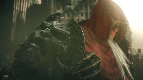
As the picture shows, the Deep Red LED is absolutely beautiful. Perhaps not as perceptibly bright as other shades of red, or other colors, for that matter. But, for this saber, there was really no choice for me, and I find the slight loss of brightness for this shade of red to be more than made up for by the richness of the color.
Altogether, I find that the time I spent waiting, and watching from the release of the Bane Mk1, to the Mk2 to have been well worth it. Everything about this version, from the fit of the parts, to the improved design elements, to the chamfering of the edges, and finally the possibility of the chrome finish; all add up to the greatest reward for my patience, in the form of a saber exactly how I envisioned it! As I mentioned before, there is no substitute for what you really want, and in this case, that is exactly what I got! The good news here for everyone, is that the chrome finish will soon be available for order. So, what I got here was a preview of what others will soon be able to do for themselves as well, and I feel fortunate to have been given this opportunity early.
For anyone who was on the fence about the Bane Mk2, this is me saying just do it! You will absolutely love it! Highly recommended for anyone who appreciates a curved saber.